A fleet operations dashboard for autonomous cabs
A Google-mentored capstone: designing the operator interface for a workflow that doesn't exist yet. Real-time tracking, alert triage and maintenance in one command centre, grounded in interviews with the dispatchers who do the human-fleet version of the job today.
- Role
- Design Engineer
- Team
- Design Engineer (Me), 4 Engineers, 1 Product Manager, 2 Google Mentors
- Timeline
- August–December 2024
- Tools
- Figma, React, Copilot, v0
Designing for a job nobody has yet. Autonomous fleets are coming out of pilot, and the operator tooling for them is still three browser tabs and a spreadsheet. I designed and built the command centre for it, and the hardest part was finding out what the work actually feels like.
I owned
- Research plan + 10 interviews
- Card sort → alert hierarchy
- All wireframes and UI
- Alert + vehicle-modal flow
- Maintenance board
- Front-end build in React
- Usability walkthroughs
Shared
- Scope with the PM
- Review with the Google mentors
Not mine
- Routing and telemetry simulation
- Backend services
Seven people, one designer. I ran the research and owned every screen, and I built the front end rather than handing off — on a team of four engineers with their own simulation to write, the interface was going to be whatever I could get running myself.
The situation
Constant data, no way to make sense of it
Autonomous vehicles generate uninterrupted streams of telemetry. The tools operators use were built for human-driven fleets, where the car reports to a person and the person reports to you.
Picture 6pm in a rush-hour simulation: 200 autonomous cabs crawling through downtown San Francisco. Dispatchers juggling ride requests, blocked roads and battery warnings across three disjointed tools and half a dozen tabs.
Real-time chaos plus incomplete data equals missed rides and stranded passengers. Every second spent working out where the answer lives is a second not spent on the decision.
The research problem
This workflow doesn't exist yet, so who do you interview?
Waymo and Zoox operate these systems and we had no access to them. Local fleet managers don't manage autonomy at scale. Interviewing nobody was not an option, and inventing a persona would have been worse — a fabricated persona would have justified whatever we already wanted to build.
So I wrote the research plan around the parts of the job that already exist: the monitoring, the dispatching, the maintenance coordination. The autonomy changes what generates the alert. It doesn't change what it feels like to triage twelve of them at once.
I'm jumping between five tools just to answer a simple question: is this car okay?
The card sort was the most useful hour. Asking people to rank alerts they invent themselves surfaces the ordering logic they can't state out loud, and that ordering became the alert panel's hierarchy.
The idea
One surface, and every alert is already an action
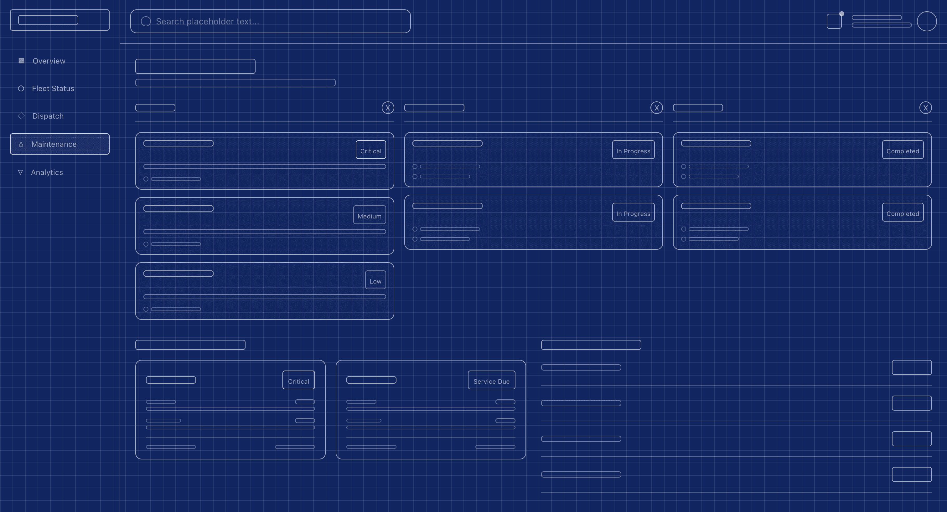
Three questions, three screens. Each screen answers exactly one:
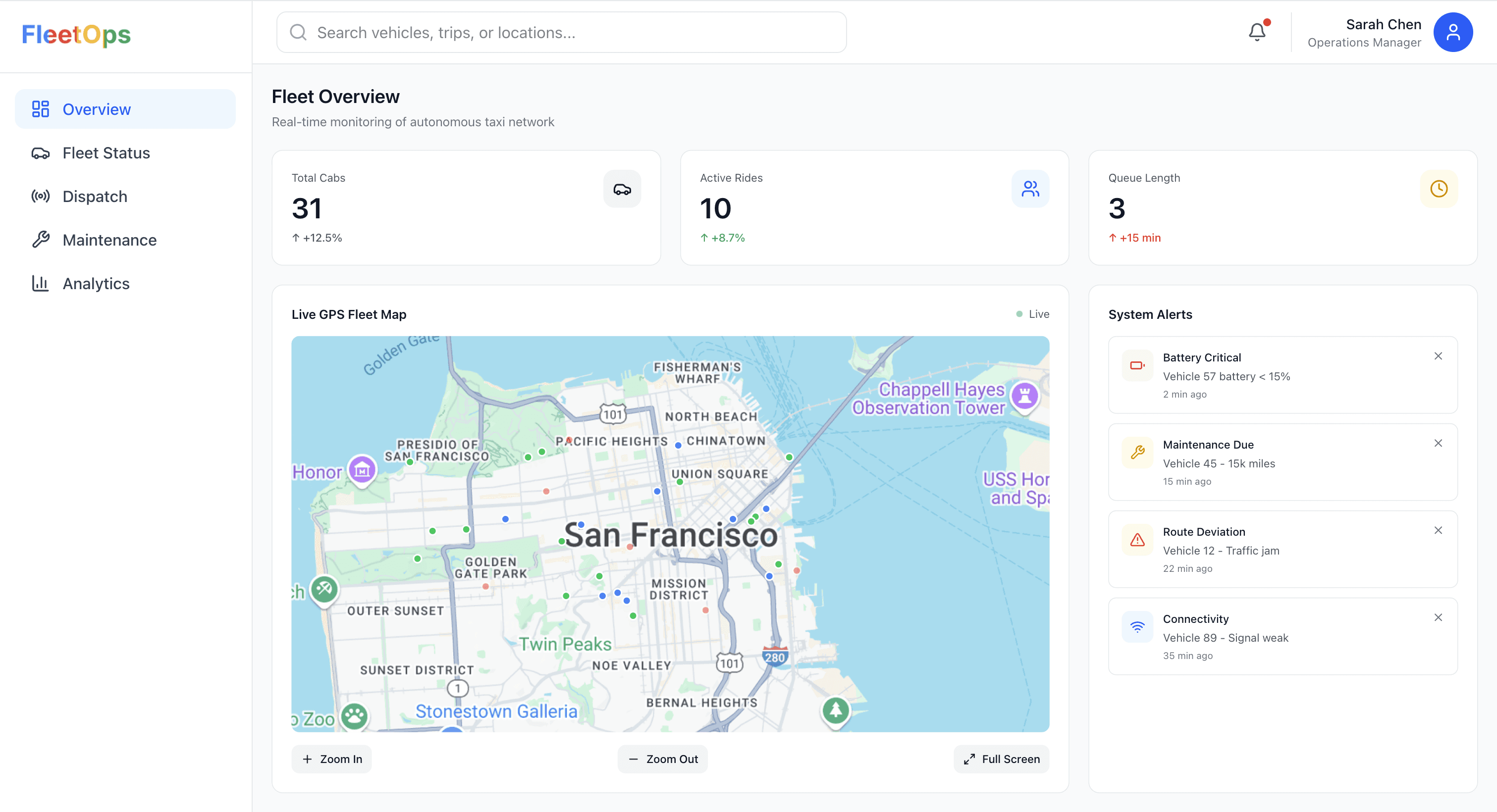
- Fleet Overview. Is my fleet running smoothly right now?
- Alert panel and vehicle modal. What needs attention, and what can I do about it?
- Maintenance board. Where are we in resolving it?
A page navigation costs the operator their context: the map state, the other eleven alerts, the thing they were half way through. In an ops-critical interface that context is the work.
The modal keeps the fleet visible behind the decision, which is why triage is two clicks rather than a round trip.
What I built
Three flows, each removing a tab switch
Maintenance without spreadsheets. A board tracking issue status from open through in-progress to resolved, paired with live health indicators and fleet stats.
Alerts that are instantly actionable. One centralised, colour-coded feed of battery, maintenance, routing and connectivity issues. Each alert opens a vehicle modal with status and immediate options, so triage is one click ("send to charging") rather than a hunt.
Route comparison with the evidence attached. A module comparing current versus optimal route times using real-time and historical traffic, so re-routing is a decision backed by something visible rather than a guess.
The numbers attached to these flows (4.2 hour average resolution, 97.3% fleet uptime, 22% faster fault resolution, 5.7 minutes saved per ride) are simulated targets, not measured outcomes. This was a capstone running against a simulation. They describe what we designed toward and what the prototype was tuned to produce, and I'd rather label them than let them read as results.
Design principles that survived
Fast cognition, seamless flow, minimal friction
- Alerts pulse and KPIs update without reloads, so the screen never needs refreshing to be trusted.
- Clicking an alert leads directly to the vehicle, never to a list of vehicles.
- Most actions are one or two clicks. Anything that took three got redesigned.
Those three sound like taste. They aren't — each one is a claim about a specific number of steps, so here is the claim itself, walkable. One incident, the way the job runs today versus the way it runs on this interface.
The alert arrives in whichever tool owns that signal — a monitoring dashboard, an email, a message from someone on the ground.
Costs the user · No single place to look means noticing is itself a task.
The thing I'd defend here is the last step. Making the maintenance record a by-product of the action, instead of a form afterwards, is the only reason the board on the third screen has anything in it. Every operator we interviewed described logging as the thing that gets skipped, and no amount of board design fixes a board nobody fills.
Reflection
What I'd do with real access
This was a simulation, and its limits are the interesting part. Designing an ops-critical interface without watching anyone use the real thing under real pressure means every claim about speed is a hypothesis.
With access to genuine AV fleet operations I'd want to test how this scales to ten times the vehicles, where the alert list stops being scannable and starts being noise, and whether an AI co-pilot surfacing issues proactively helps or just adds another voice to argue with.
The principles I'd carry regardless: design for action under pressure rather than visibility alone, validate clarity through task-based testing rather than screen reviews, and centre the workflow on the human behind the dashboard.