Designing AI localization workflows for global media teams
Vosyn's AI could translate quickly. Reviewing what it produced meant moving between disconnected panels, so generation was fast and validation was slow. I redesigned the review workflow to keep generation, comparison and editing in one context.
- Role
- Product Designer
- Team
- Product Designer (Me), 2 Designers, UX Researcher, Product Manager, 2 Developers
- Timeline
- Aug–Dec 2024
- Tools
- Figma (FigJam + Design), Balsamiq, Storybook, UserTesting
The translation took seconds. Checking it took minutes. I spent an internship on the unglamorous half of an AI product: not generating the output, but making it cheap to trust.

I owned
- Review-workflow redesign
- Contextual inquiry (segment Q&A)
- Flagging model
- Usability sessions + synthesis
- Storybook components
- 5 features prototyped
Shared
- Research plan with the UX researcher
- Scope with the PM
- Two other designers on adjacent surfaces
Not mine
- Translation models
- Platform architecture
This was an internship on a six-person product team, and the honest framing is that I owned two features inside a larger product rather than the product. The two below are the ones where the design call was mine end to end — the reframe that produced them, the patterns that came out of it, and the components that shipped into the team's Storybook.
Under NDA, so this is written with redacted interfaces and no internal artefacts. Everything below is the reasoning and the shape of the work, which is the part that travels anyway.
The situation
Generation was fast. Verification was where the time went.
Vosyn builds AI tools for translating and localizing content across languages. I joined as a product designer on the internal tooling used for AI-assisted translation and review — the surfaces the localization team lives in, not the ones customers see.
I was brought in on a brief about the generation UI. The models were good and the workflow around them was not, and that turned out to be the whole project: reviewing a single translation meant moving between multiple panels, and reviewers struggled to compare original against translated content without losing their place. Reframing the brief from "improve the translation screen" to "the review is the product" was the first thing I did and the thing everything else came out of.
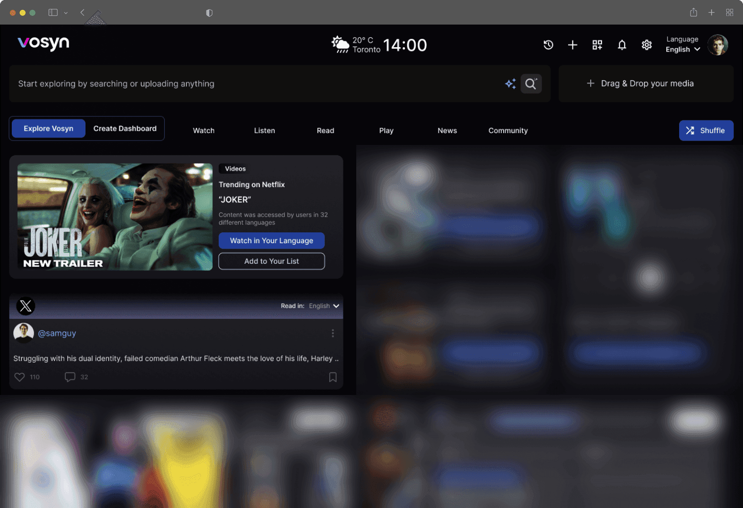
A consistent pattern in usability sessions: nobody complained about translation quality. They complained about finding out whether it was good.
The reframe
The unit of work isn't the translation, it's the check
The unit of work isn't the translation. It's the check.
Once I stopped treating the output as the product and started treating the review as the product, the design questions changed. Not "how do we present a translation" but "what does a reviewer need in view at the moment they decide it's fine".
Two rules fell out of that, and they are the whole redesign.
The reviewer lands on the translated output. The source sits on another surface.
Costs the user · The comparison hasn't started yet and the context is already split.
Getting there was unglamorous. I sat with reviewers working real files and timed where the minutes went, which is how the two rules above stopped being opinions: almost none of the time was spent reading translations, and almost all of it was spent re-establishing which two things were being compared. The UX researcher ran the formal sessions; I ran the workflow analysis and turned it into the patterns below, then prototyped and tested each one before it went near a sprint.
The finding that changed my mind: reviewers were not slow readers. They were fast readers doing the same read three times, because each surface change meant re-finding their place. Nothing about that is a translation-quality problem, and no amount of model work would have touched it.
What I designed · 01
Put the two texts in one view, and point at what needs a human
The first pattern is the boring one that mattered most. Source and translation in a single view, so comparison is simultaneous rather than held in memory, and the rows likely to need a human are marked rather than leaving every row equally suspect.
The flags are the design opinion here. A review tool that treats every segment as equally likely to be wrong spends the reviewer's attention evenly, which is the same as spending it badly. Routing attention is the feature.
Which is why the flag categories are the part I'd defend. They are not confidence scores; a low-confidence score tells a reviewer that the model is unsure, which they can neither check nor act on. Each flag names a failure mode a human can adjudicate in one read — an idiom carried over literally, a register that drifted formal, a glossary term that resolved inconsistently. And each one shows its reasoning, because a flag a reviewer can disagree with is a flag they will keep using, while an opaque one gets switched off the first week it is wrong.
The limit I'd name up front: this only routes attention toward failure modes we thought to define. A model error in a category nobody anticipated looks exactly like a clean segment, and a reviewer trusting the flags is now skimming it faster than before. Flagging makes good reviewers faster; it does not make an unreviewed file safe, and I'd want that written into how the feature is introduced, not just into how it works.
What I designed · 02
Answers that name where they came from
The second piece was the contextual inquiry system: asking questions against a selected stretch of video and getting responses grounded in that segment rather than the whole file.
The design problem is trust. An assistant that answers from everywhere gives you nothing to check. Scoping the question to a segment, and having the answer say which segment it used, turns a claim into something verifiable.
Pick a question. The answer names the segment it came from.
Same principle as the flags: the interface's job is to make checking cheap. A grounded answer can be disagreed with. An ungrounded one can only be believed or ignored.
Outcomes
Measured after usability testing
System Usability Score, usability testing
Teams validated machine translations faster, and the friction that had been sitting after generation moved out of the way.
Worth stating plainly: these come from usability testing during the internship, not from production telemetry after launch. The SUS movement is real and measured, on a test cohort rather than the full user base.
Reflection
Generating is half the product
The lesson I took from this one, and have used since: for AI products, producing the output is rarely the bottleneck. Evaluating it is.
Users need efficient ways to check, correct and trust what the model gives them, and that surface gets far less design attention than the generation flow does. Small changes to workflow structure moved the needle more than any new feature would have. Reducing the cost of verification is a product strategy, not a polish task.