Building a content execution system for SMBs
MoFlo could generate and schedule content, and users still weren't posting. The bottleneck wasn't generation quality, it was the cost of starting. I redesigned the product from a creation tool into a system that prepares work and asks for a decision.
- Role
- Lead Product Designer
- Team
- Product Designer (Me), CTO, Lead Developer, 2 Dev Interns
- Timeline
- 5 Weeks
- Tools
- Figma (Design, Make, Jam), Claude Code, Lottielab, v0, Fullstory
Every tool worked and nobody was posting. My first fix was the obvious one, and it barely moved. The thing that actually worked was giving up on getting users to start.
I owned
- Problem framing
- Customer interviews
- The falsifying experiment
- Information architecture
- Gap-detection logic
- Approval queue + review UI
- Prototypes shipped to eng
Shared
- Signal thresholds with the CTO
- Build sequencing with the lead dev
Not mine
- Generation models
- Publishing integrations
- Backend implementation
I was the only designer on this. That meant I also owned the part designers usually get to skip: writing down which behaviour we were betting on, running the experiment that could kill it, and telling the team when it did.
The situation
The product worked. The behaviour didn't.
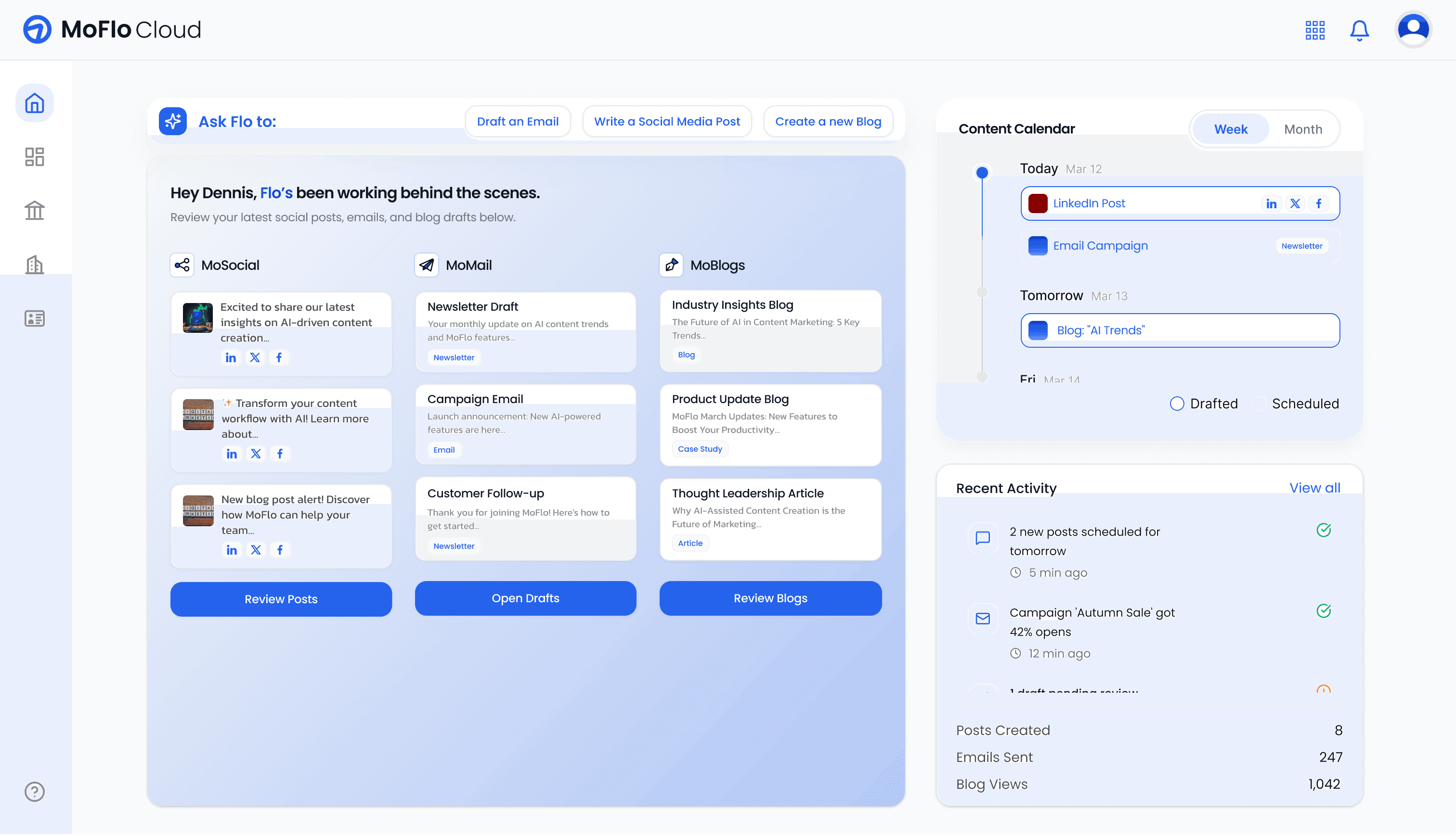
MoFlo is an AI content platform for small businesses: multi-platform publishing, AI generation, scheduling. All of it functioned. Users could generate captions and visuals and schedule across channels.
They just didn't.
Owners opened the dashboard, looked at the numbers, and left. The gap was behavioural, not technical.
The wrong guess
I assumed the generation experience wasn't good enough
My first hypothesis was the comfortable one: output quality. If the captions were better and the flow felt less uninspiring, engagement would follow.
So I tested it before rebuilding anything. I simplified the input, surfaced suggested topic prompts, and cut friction out of the generation UI.
Drop-off improved slightly. Most users still stopped after one or two posts. The experiment was cheap and it was the most useful thing I did, because it ruled out the explanation everyone on the team preferred.
What was actually happening
Users weren't stuck on quality. They were stuck on starting.
I ran interviews with active customers about how they approached content week to week.
How do you decide what to post? When do you create content? What happens when you open the dashboard? What usually stops you from publishing?
None of them ask about the product. If I'd asked what they thought of the generator I would have got opinions about the generator, and the answer was never going to be in there.
It takes too much time to create and schedule a post. I just want someone to do all of it for me.
I open the dashboard, look at the numbers, and then close it. It feels like I have to think too much before I can even start.
The pattern: content creation was not part of a structured workflow. It was something they did when they had time or felt pressure. Every week started from zero.
They didn't lack tools. They lacked momentum. The friction was cognitive: the repeated mental effort of deciding, in a week already full of real work.
The reframe
Stop asking users to initiate
If the expensive step is starting, the system should do the starting.
That is the whole idea, and everything below is a consequence of it.
Nothing happens until the user opens the dashboard and chooses to make something. There is no queue, no prompt, no starting point.
Costs the user · The whole week's output hangs on remembering, and on having the energy to start.
Getting there
Three structures I built and rejected
My earliest sketches split content by status so work was visible across stages, to make content feel like committed work rather than optional drafts.
It didn't hold up. Users still had to decide what to do first. The system was organised but not decisive.
Insights at the top, generated content below, calendar to the side. Metrics, action, schedule.
This still required interpretation: read the signal, translate it into an action, navigate to drafts. It asked users to think in exactly the place they had already told me they stop.
Early explorations put the calendar up front as a place to plan. But these users were not planners, they were reactors.
So the calendar became a consequence instead: approval auto-fills it, hovering a scheduled day shows a lightweight preview rather than a heavy modal. Confirmation, not composition.
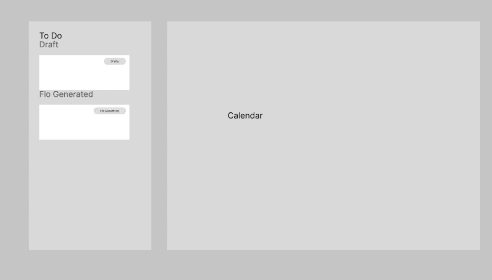
The difference between the final pipeline and the first one is one column. "Flo Generated" is not a status the user moves things into. It is work the system did while they were gone.
What shipped
Review and approve, instead of plan and create
Three pieces, in the order they run. I designed all three and prototyped each one before it went to the team, so what the developers got was a working thing to build against rather than a spec to interpret.
Gap detection decides what to make. The engineering was straightforward; the design work was deciding what counts as a gap, and how loudly to say so. I scoped it to three signals — platform inactivity, a depleting content runway, an imbalance across channels — because those are the three an owner can act on in one click. Everything else I could have surfaced (engagement dips, follower deltas, best-time-to-post) fails that test: it's information, and information is what these users were already closing the dashboard on.
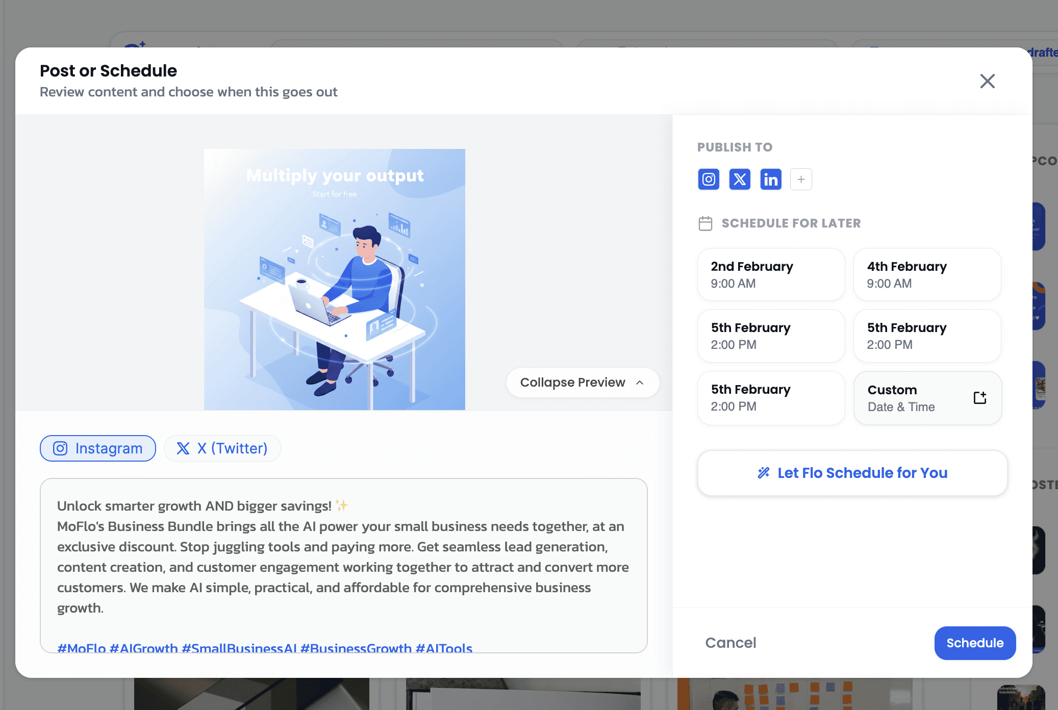
One review, not three previews. A post that goes to Instagram, LinkedIn and X used to mean checking it three times in three places. I put all three renderings in one view, which sounds obvious and was the piece I had to argue for hardest: it costs real screen space, and the alternative — a platform switcher — costs a decision per platform, which is the exact currency the whole project was trying to stop spending.
Approval is the only decision left. Approving triggers an optimised cadence rather than opening a date picker. Users can still override the time — I kept that, because taking it away turns a system that helps into one that decides — but the default path has no scheduling step in it at all.
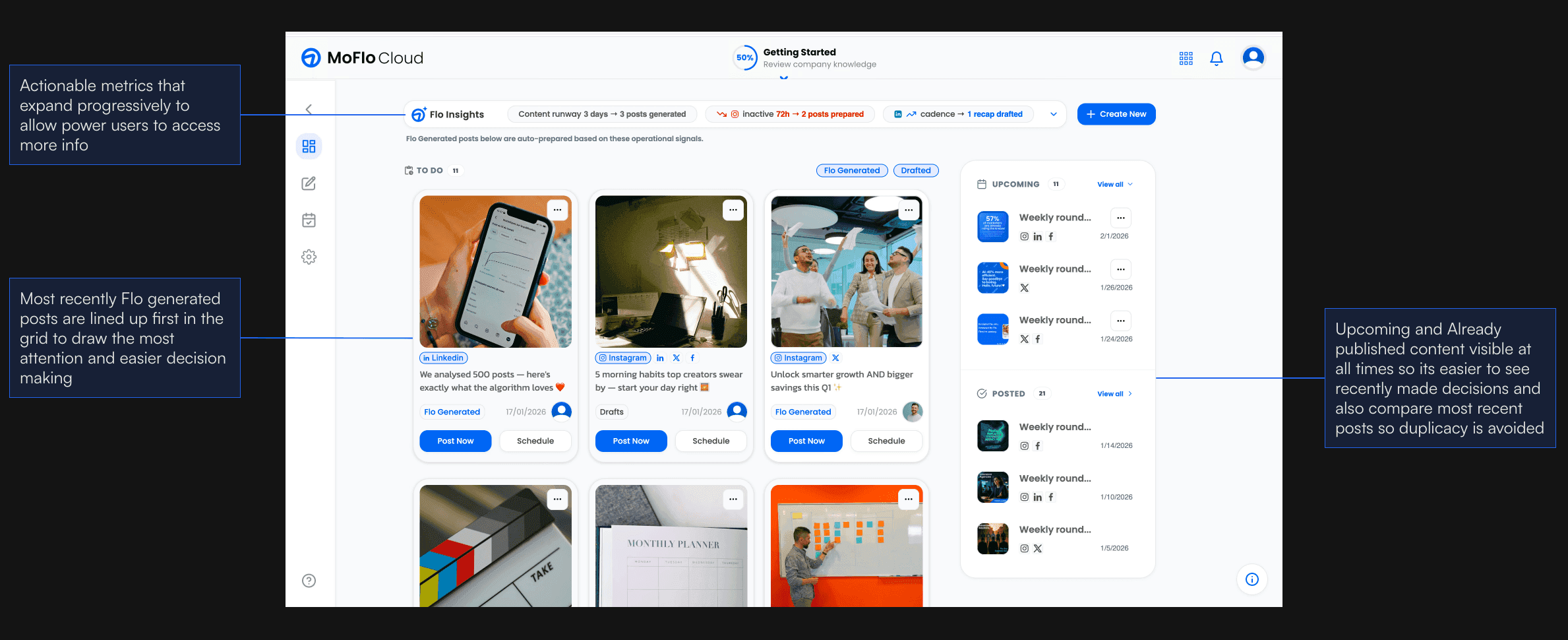
The pattern under all three: the system spends the decisions, the user spends the judgment. That split is why "AI does it for you" didn't have to mean handing over control — approval is a real veto, and the queue only exists to make using it cheap.
Impact
Consistency improved when initiative wasn't required
Within one month:
Weekly drop-off, one month after launch
Users stopped planning content. They started maintaining it.
The 70% figure is the one I'd interrogate if someone showed it to me. Approving without edits is only a good sign if the drafts were good; it looks identical to users rubber-stamping a queue to get through it. What separates the two here is the publishing number: rubber-stamped content doesn't get posted to three platforms. If those two had moved in opposite directions I'd have read the 70% as a failure, not a win.
Reflection
Activation is a design problem, not a model problem
AI quality alone doesn't drive adoption. I spent the first stretch of this project improving output because that was the legible thing to improve, and the experiment that disproved it took two days.
Behavioural architecture mattered more than feature depth. Reducing the cost of starting improved consistency without adding a single capability.